Does Green Packaging Look Healthier
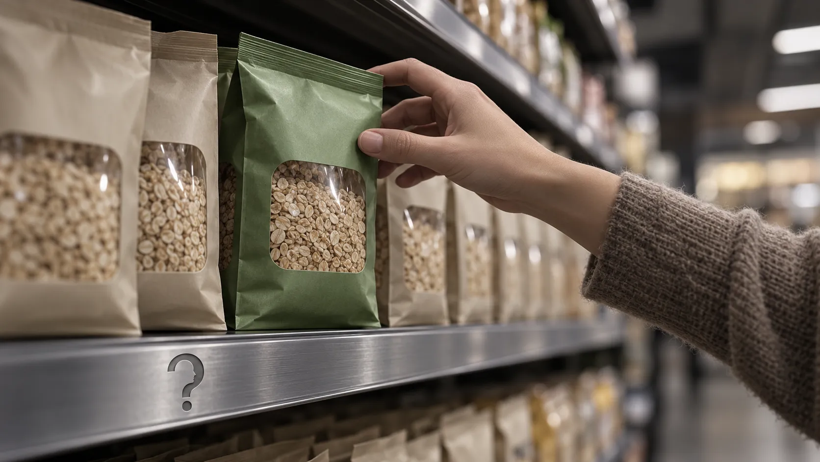
A green calorie label made a candy bar look healthier than a red one with the same calories. Studies of whole packs are less tidy: vivid colour cuts both ways, and green can also read as environmental and cost a product credibility. The evidence supports a modest cue, mostly measured by asking people to rate pictures.
Answer to the question
Does green packaging make food look healthier?
Sometimes. A green calorie label made a candy bar look healthier than a red one with the same calories, and a 2023 review found cool colours usually raised healthiness ratings. Results for whole packs are mixed: vivid colour was rated less healthy in one study and healthier in another.
Key takeaways
- Schuldt (2013) changed a candy bar's calorie label from red to green with the calories unchanged, and 93 students rated the green-labelled bar as healthier.
- Steiner and Florack (2023) reviewed 35 studies in 20 articles: cool colours, blue and green, usually raised healthiness ratings, but a white label with a smiley face beat green in one study.
- Mead and Richerson (2018) found vivid, highly saturated packs rated less healthful across four experiments, while Sonja Kunz and colleagues (2020) found more saturated drinks rated healthier.
- In the Kunz study, 171 participants rated drinks made 25 per cent more and 25 per cent less saturated, and perceived freshness fully explained the small health difference.
- Pancer and colleagues (2017) found in three experiments that a green colour without an eco-label, or an eco-label without green, lowered perceived product efficacy.
A systematic review of the published studies on packaging colour and perceived healthfulness concludes that colour does shape health judgements, though results vary with product category, country, gender and attitudes to healthy eating, which the review lists as moderators.
Green packaging can make food look healthier, but the best-known evidence concerns a calorie label and not a pack, and the results for whole packs split on colour saturation and on what the green is taken to mean. The effect depends on what the green is attached to.
Adam Alter's Drunk Tank Pink is the book this question starts from. It places colour among the cues around us that steer behaviour without being noticed. The book also sits in the social-priming literature, parts of which have not replicated, and the vault's audit of it advises checking each colour claim before relying on it. The red-and-attraction finding it reports is a case in point, covered in [What Red Actually Does](https://thewhyweproject.com/articles/what-red-actually-does). The packaging studies differ in kind. Participants are asked what they think of a food, and the outcome is a rating, not a changed action.
A green label on a candy bar
Schuldt's experiments are the ones most often cited for the idea that green means healthy.
In the first, which Cornell University described when the paper appeared, 93 university students imagined being hungry in a grocery checkout line and saw a candy bar with either a red or a green calorie label. The calorie count was identical. The bar under the green label was rated healthier.
In the second experiment, reported in the same 2013 paper, 39 online participants saw candy with a green or a white label and rated how much healthy eating mattered to their food choices. The more a person valued healthy eating, the less healthful the white-labelled bar looked to them, and the green label removed that pattern. Schuldt described green labels as a buffer for foods of relatively poor nutrition. Both sample sizes are Cornell's figures, taken from its description of the paper.
Two features limit what this can carry. The coloured item was a calorie label, a piece of information the viewer was already reading, so the test was colour on a number and not green packaging as a shopper meets it. And a green-versus-red contrast cannot say how much of the gap belongs to green and how much to red. The result also fits the [health halo](https://thewhyweproject.com/articles/how-far-the-halo-effect-spreads), where one favourable cue lifts judgements it has no right to lift.
The coloured item was a calorie label, a piece of information the viewer was already reading.
Whole packs behave less tidily than labels
A 2023 systematic review by Steiner and Florack pooled 20 articles containing 35 studies of packaging colour and perceived healthfulness. Cool colours, blue and green, were linked to higher healthiness ratings in most studies, though not all. Green labels often helped people identify the healthier product, and green calorie labels were seen as healthier than red ones. The advantage was not consistent. In one study it held for men only, and in another a white label with a smiley face beat both green and red labels. The authors call green a candidate for a colour that raises health judgements across contexts, and they add that in a category where health is unexpected, such as chips, the effect might disappear.
The review lists product category, country, gender and attitudes to healthy eating as moderators, and notes that most studies relied on self-report with methods that varied widely. Its authors propose three routes by which colour can move a health judgement and say they can operate together: colour read as an explicit health signal, colour that triggers beliefs about the food, and colour that prompts a mental simulation of eating it. The routes are a framework for explaining the pattern, not something the 35 studies tested directly. They are also why one green can mean different things on different foods.
Vividness cuts both ways
Hue is only one dimension of a colour, and green packaging can be pale or vivid, muted or bright. Two studies varied saturation, the vividness of a colour, and reached opposite conclusions. Mead and Richerson (2018) ran four experiments, with potato chips and nutrition bars among the products, and found that foods in vivid, highly saturated packaging were rated less healthful than foods in muted packaging. They traced this to conceptual fluency: shoppers meet unhealthy foods in saturated packaging often, so vividness comes to feel like the look of an indulgent product. Subjective nutrition knowledge weakened the effect, and restrained eating strengthened it.
Food and drink images gave the reverse result in a 2020 study by Sonja Kunz and colleagues. In its second experiment, 171 participants rated the same 20 drinks in versions made 25 per cent more and 25 per cent less saturated, with the other colour dimensions held constant. The more saturated versions were rated healthier and tastier. The health difference was very small, the taste difference larger, and perceived freshness explained the health effect completely.
Two earlier studies in the same paper, with 236 people rating 20 snacks and 116 students rating 20 drinks, found that ratings of healthiness and tastiness rose and fell together, and that the link was weaker when the pictures were grey. That difference was no longer reliable once the attractiveness of the products was controlled for.
The two saturation results can be reconciled on paper, since indulgent snacks and juices carry different associations and the review names product category as a moderator. That is a hypothesis about the gap, not a result. The separation of hue from lightness and saturation is also why the blue findings in [Why Brands Reach for Blue](https://thewhyweproject.com/articles/why-brands-reach-for-blue) are hard to pin on hue alone.
That is a hypothesis about the gap, not a result.
Why would green lower a product's credibility?
Green packaging carries a second meaning that has nothing to do with nutrition. Pancer and colleagues (2017) ran three experiments on the colour green and eco-labels, the two cues brands use to signal environmental friendliness, and measured perceived product efficacy, meaning how well the product was expected to work, and purchase intention. Using either cue alone, a green colour without an eco-label or an eco-label without green, lowered perceived efficacy. The authors attribute this to category ambiguity: an isolated cue activates a functional schema and an environmental schema together, and the two compete.
For food, the lesson is that green packaging is read through more than one idea. A pack can borrow from health, from nature and from environmental virtue, and each reading brings a different expectation about taste and quality. Why a shopper would pay to be seen choosing the environmental reading is the subject of [Going Green Where Someone Can See You](https://thewhyweproject.com/articles/going-green-where-someone-can-see-you), and what happens when the environmental claim has no system behind it is covered in [What Recycling Was Asked to Do](https://thewhyweproject.com/articles/what-recycling-was-asked-to-do).
Where the four accounts leave the claim
The four accounts above, label colour, hue across whole packs, saturation and the environmental meaning of green, do not carry equal weight. The label account has the cleanest contrast, two small experiments in which a green calorie label moved a rating, and it says least about packs. The hue account has the widest base, 35 studies, and the authors who gathered it found exceptions among them. The saturation account is the least settled, with two studies that point opposite ways on different foods. The environmental account is about efficacy, not health, and bears on food only by analogy.
The best-supported claim is therefore narrow. A green calorie label can raise a food's healthiness rating relative to a red one, and cool colours often help a health reading across package studies. Beyond that the effect is conditional on the product, the viewer and the vividness of the colour, since a label and a whole pack have been tested separately and saturation has moved ratings in both directions.
For a brand, that means a pack's colour should be tested in its own category before anyone assumes it will carry a health message, and tested on the viewers who will see it, because in one study the advantage held for men only. For a shopper, the cue is real but weak and easy to over-read, so read the nutrition panel, which was measured, not designed.
Common questions
Does green packaging make food look healthier?
Sometimes. Schuldt found a green calorie label made a candy bar seem healthier than a red one with identical calories, and a 2023 review found cool colours linked to higher healthiness ratings in most studies. The effect was not consistent across products, genders or label types.
Is vivid green packaging a sign of healthy food?
Not as a rule. Mead and Richerson found vivid packs rated less healthy, while Kunz and colleagues found more saturated drink images rated healthier and fresher. Product category is a plausible explanation that nobody has isolated.
Why does green sometimes make a product look weaker?
Pancer and colleagues found that a green colour without an eco-label, or an eco-label without green, lowered perceived efficacy. They attribute it to category ambiguity, where functional and environmental ideas compete in the shopper's mind.
Should shoppers trust green packaging?
Treat it as a design choice, not a measurement. The nutrition panel and ingredient list describe the food. The colour describes how the brand wants it to be read.
Sources
Schuldt, J. P. (2013). 'Does green mean healthy? Nutrition label color affects perceptions of healthfulness.' Health Communication, 28(8), 814-821. doi:10.1080/10410236.2012.725270. Sample sizes (93 and 39) are from Cornell University's news release, news.cornell.edu/node/279365.
Steiner, K., & Florack, A. (2023). 'The influence of packaging color on consumer perceptions of healthfulness: A systematic review and theoretical framework.' Foods, 12(21), 3911. doi:10.3390/foods12213911
Mead, J. A., & Richerson, R. (2018). 'Package color saturation and food healthfulness perceptions.' Journal of Business Research, 82, 10-18. doi:10.1016/j.jbusres.2017.08.015
Kunz, S., Haasova, S., & Florack, A. (2020). 'Fifty shades of food: The influence of package color saturation on health and taste in consumer judgments.' Psychology & Marketing, 37(7), 900-912. doi:10.1002/mar.21317
Pancer, E., McShane, L., & Noseworthy, T. J. (2017). 'Isolated environmental cues and product efficacy penalties: The color green and eco-labels.' Journal of Business Ethics, 143(1), 159-177. doi:10.1007/s10551-015-2764-4
Alter, A. (2013). Drunk Tank Pink: And Other Unexpected Forces That Shape How We Think, Feel, and Behave. Penguin Press.